3rd January 2022 - 18th February 2022 / Week 1 - Week 7
Nurul Asilah Binti Mohamad Asif (0353346)
GCD 60804 | DESIGN PRINCIPLES / Bachelor of Design (Hons) in Creative Media / Taylors University
Task 1 / Exercise 2
LECTURES
Week 2 (13/1/2022)
Principle of similarity, continuation, closure, proximity, and figure/ground
(i) Principle of similarity -
The human eye tends to perceive similar elements in a
design as a complete picture, shape, or group, even if those
elements are separated.
(ii) Principle of continuation -
The human eye follows the paths, lines, and curves of a
design, and prefers to see a continuous flow of visual
elements rather than separated objects.
(iii) Principle of closure -
The human eye follows the paths, lines, and curves of a
design, and prefers to see a continuous flow of visual
elements rather than separated objects.
(iv) Principle of proximity -
The process of ensuring related design elements are placed together. Any
unrelated items should be spaced apart. Close proximity indicates that
items are connected or have a relationship to each other and become one
visual unit which helps to organize or give structure to a layout.
(v) Principle of figure/ground -
Objects are instinctively perceived as being either in the foreground or the
background. They either stand out prominently in the front (the figure) or
recede into the back (the ground).
Law of symmetry & order
This law states that elements that are symmetrical to each other
tend to be perceived as a unified group. Similar to the law of
similarity, this rule suggests that objects that are symmetrical with
each other will be more likely to be grouped together than objects
not symmetrical with each other.
Balance (part 2) Symmetrical balance, Asymmetrical balance, The golden ratio, and Rule of thirds
(i) Symmetrical balance -
The equal arrangement of elements on either side of the central axis (horizontal or
vertical) results in bilateral balance.
(ii) Asymmetrical balance -
Unequal visual weight on each side of the composition that leads to one side of the composition might contain a dominant element, which could be balanced
by a couple of lesser focal points on the other side.
(iii) The golden ratio -
The Golden Ratio has been used for centuries as a guide to creating visual balance in architecture
and paintings.
(v) Rule of thirds -
It is a composition guideline to create more dynamism to a work of
design/photography/film/painting.
Hierarchy and Alignment -
(i) Hierarchy -
Hierarchy is the choreography of content in composition
to communicate information and convey meaning.
(ii) Alignment -
Alignment is the placement of elements in a way that
edges line up along common rows or columns, or their
bodies along a common center.
Scale and proportion -
(i) Scale -
Scale is the size of one object in relation to the other
objects in a design or artwork.
(ii) Proportion -
Proportion refers to the size of the parts of an object in
relation to other parts of the same object.
INSTRUCTION
Week 3 (17/1/22)
Unity
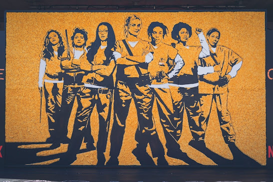
The first thing I thought of when it comes to unity is "all in one" and "woman power". I came across various reference photos which have a lot of mixes between contrast and repetition with unity, such as the picture shown in fig 1.1
Fig 1.1 reference
The picture shown has a lot of meaning, how inspiring. I decided to go with two colors instead, which are orange and black. The reason being is because it was inspired by the series I have watched called Orange is the new black. It was about all the women in jail coming together and uniting while helping each other out in need. An example of the orange is the new black shown in fig1.2
Fig 1.2 inspiration
I decided to sketch hands coming together in a circle to represent help in need to express how much we all do need someone in our lives, especially a woman. Towards the end, I decided to add both hands held together to represent love for all women.
Fig 1.3 lined art
Fig 2.1 Final version
FEEDBACK
week 2 (13/1/22)
I was told to explore more on the reference and it gave me the idea of looking into the colors as well which made me use a simple color that also has a meaning towards the color such as "Orange is the new black".
REFLECTION
I must say I did struggle quite a lot finding a definition of Unity. Although it has a lot to find a different one would not hurt. Not only do I like to design but to give meaning to my designs. A meaningless design would be a waste to me. It took time to search for a certain picture to get an idea of unity but i managed to find it in the end.


very good!
ReplyDelete