Digital Photography & Imaging | Project 1: Collage
DPI | Week 2
7/4/2022
Nurul Asilah Binti Mohamad Asif | 0353346 | B'Creative Media
Digital Photo and imaging
Lecture
Week 2 (7/4/2022)
Introduction to basic composition.
Understanding composition is an idea for every good design. This is when all elements come together to create one design.
Element of a good composition.
1. Focal Point -
- Ask yourself where does your eye lie in every design and what does it focus on?
- Each design has a strong focal point that gives out attention to the viewers themselves to explore more of the design.
2. Scale & Hierarchy -
- Scale is often used to help communicate hierarchy by drawing attention toward and away from certain elements, thus signifying their importance to the communication.
3. Balance the elements -
- A good technique for mastering asymmetrical balance is to think of each element as having a "weight" to it.
- Smaller objects might 'weight' less than larger objects, and heavily textured elements might 'weigh' more than flatly colored elements.
4. White Space
- White space is mostly known as "empty space" to balance up the main focus of a composition.
- White space when used strategically can help boost your design's clarity and overall look by balancing out the more complicated and busy parts of your composition with space that helps your design to breathe.
White Space
Rule of Thirds
- The rule of thirds is the process of dividing an image into thirds, using two horizontal and two vertical lines. This imaginary grid yields nine parts with four intersection points.
- Positioning the most important elements of your image at these intersection points, you produce a much more natural image. It is also suggested that any horizon is placed on either the top horizontal line or the bottom horizontal line.
The Rule of Thirds is a way to -
- Use composition techniques that are in line with what's naturally pleasing to the eye.
- Creatively use negative space.
- Create a conversation between the subject and background.
Golden Ration
In design, the Golden Ratio boils down to aesthetics; creating and appreciating a sense of beauty through harmony and proportion. When applied to design, The Golden Ratio provides a sense or artistry. It is also a useful guideline for determining the dimensions of the layout. One very simple way to apply the Golden Ration is to set your dimensions to 1:1:618.
Project 1 (Part 1) - Physical Collage
We were assigned to do a physical collage where we collect our own cut-out pieces of pictures and make it our own.
Composition 1
Fig 1.1 Collage 1 (7/4/2022)
Fig 1.2 Collage 2 (7/4/2022)
Fog 1.3 Collage 3 (7/4/2022)
Week 3 (14/3/2022)
Introduction to Photoshop
Sir Martin a few of the basics of the photoshop on how to use the tools such lasso tool and magic wand tool but of course many more. We also worked on our layering.
Fig 1.4 Photoshop exercise (14/4/2022)
Project 1 (Part 2) - Digital Collage
We were assigned to download all the pictures in google drive given by Sir Martin Via email.
On that, I went ahead and did some visual research of my own to get a head start on my editing.
Fig 1.5 Retro Futurism (15/4/2022)
Fig 1.6 Photoshop by Arlene Banks (15/4/2022)
Fig 1.7 Collage paint by Catherine (15/4/2022)
First design
For the first design, I decided to gather a few images given by Sir Martin and got some ideas from the references in Fig 1.7.
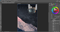
Fig 1.8 (first design process) 16/4/2022
Fig 1.9 (first design process) 16/4/2022
Fig 2.1 (first design process) 16/4/2022
Fig 2.2 First final (16/4/2022)
Second design
For the second design, I was thinking about the idea of a vintage collage mixed with a little bit of a futuristic design.
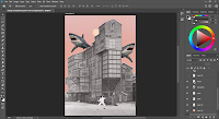
Fig 2.5 (second design process) 16/4/2022
Fig 2.6 (second design process) 16/4/2022
Fig 2.7 (second design process) (16/4/2022)
Third design
As for my third design, I was inspired by Fig 1.5 reference. Therefore, I gathered a few images that I have and included a few new images to add a bit more volume to my design.
Fig 2.8 (third design process) 17/4/2022
.png)


Comments
Post a Comment