Typography - Task 1
.png)
28/3/2022 - 25/8/2022
Nurul Asilah / 0353346 / Bachelors of Design (Hons) in Creative Media
Lecture
Week 1: Development/Timeline | 28/3/2022
We started the class with a brief understanding of what the syllabus is about. Afterward, everyone watched a step-by-step video on how to create a blog, I didn't have to because I have created it in my previous semester. So I killed the time by creating another post about the Typography class.
On that note, we start off with our first exercise which is by finding random words with the actions we do daily. Then we were assigned to do the lettering on the words themselves.
Finally, to finish our class, we played a little bit of a game to introduce ourselves to each other. Ice-breaking, Sir Vinod calls it. A pretty fun game I would say.
Early letterform development: Phoenician to Roman
Scratching into wet clay with sharp sticks or craving stones with a chisel was written in the Roman era.

Fig 1.0 Scratching into wet clay with a sharp stick (28/3/2022)

Fig 1.1 Stone carving with a chisel (29/3/2022)
The forms of uppercase and lowercase evolved out of these tools. Uppercase forms were simple combinations of straight lines and pieces of circles.

Fig 1.2 Evolution of Phoenician letter (29/3/2022)
The figure below shows the writings of the Phoenicians who wrote from right to left.
The Greeks wrote from left to right (boustrophedon)

Fig 1.3 boustrophedon (29/3/2022)
These marble-painted letterforms were used by Etruscan, then the Romans before carving it. The quality of strokes changes in weight from vertical to horizontal, broad strokes, brought up into the carved letterforms.

Fig 1.4 Phoenician to Roman (29/3/2022)
Hand script from 3rd to 10th century CE
Square capitals can be found in Roman monuments. Serif was applied to the finish of the main strokes.

Fig 1.5 Square capitals (29/3/2022)
Rustic capitals (square capitals compressed) take lesser time to write but are harder to read because of their compressed nature.

Fig 1.6 Roman capitals (29/3/2022)
Then, cursive letterforms were used to speed up the writing process. As a result, lowercase letterforms were developed.

Fig 1.7 Cursive letterforms (29/3/2022)

Fig 1.8 uncials and half-uncial (29/3/2022)
The monks rewrote texts using uppercase, minuscule, capitalization, and punctuation.

Fig 1.9 Carolingian minuscule (29/3/2022)
Right after that blackletter was introduced. It is a condensed strongly vertical letterform.

Fig 2.0 Blackletter (29/3/2022)
Lastly, Gutenberg is a different brass matrix/negative impression for each letterform.

Fig 2.1 Gutenberg printing press (29/3/2022)
Week 2: Basic/Describing letterforms | 4/4/2022
Today Mr.Vinod decided to introduce himself and tells us about his background learning. Right after he introduced himself, he showed us how to update our feedback on the google sheet, that way we can look back to fix our mistakes. Later that day, he also checked everyone's work and gave us some feedback to make it better. In between, he told us to ask ourselves these questions about our work.
1. Are the explorations sufficient?
2. Does the expression match the meaning of the word?
3. On a scale of 1–5, how strong is the idea?
4. How can the work be improved?
Basic/Describing letterforms
Typography takes on a series of technical terms. These describe specific parts of a letterform. We must get to know a letterform's component parts in order for us to identify specific typefaces.

Fig 2.2 describing letterforms (4/42022)
Baseline: imaginary line the visual base of the letterforms
Median: imaginary line defining the x-height of letterforms
X-height: height in any typeface of the lowercase 'x'
Stroke: any line that defines the basic letterform
Apex/Vertex: the point created by joining two diagonal stems (apex above, vertex below)
Arm: short strokes of the stem of a letterform, horizontal or inclined upward.
Ascender: the portion of the stem of a lowercase letterform that projects above the median
Barb: the half-serif finish on some curved stroke
Beak: half-serif finish on some horizontal arms
Bowl: a rounded form that describes a counter (opened or closed)
Bracket: transition between serif and stem
Cross Bar: a horizontal stroke that connects two stems together
Cross Stroke: a horizontal stroke that joins two stems together ( f & t)
Crotch: interior space where two strokes meet
Descender: portion of a stem that projects below the baseline
Em/en: initially referring to the width of uppercase M, now is the distance equal to the size of the typeface: En is half the size of Em (em/en spaces & em/en dashes)
Finial: rounded non-serif terminal to a stroke
Leg: short stroke off the stem of the letterform
Ligature: character formed by combining two or more letterform

Fig 2.3 Ligature (4/4/2022)
Uppercase: capital letters

Fig 2.4 Letters (4/4/2022)
Lowercase: includes the same characters as uppercase.

Fig 2.5 Lowercase letters (4/4/2022)
Week 3: Text/Tracking: Kerning and Letterspacing | 11/4/2022
Mr. Vinod did a short demonstration of how to stroke the brushes on certain words like "wink" and "grow". There's also a short lecture about the history of typography. We started with animated Gifs, and since it was quickly done, Mr.Vinod went and quickly viewed everyone's work or to make any improvements.
Text/Tracking: Kerning and letterspacing
Kerning: adjustment of space between letters. Always mistaken as letterspacing
Letterspacing: to add space between the letters.

Fig 2.6 Kerning and letter-spacing (11/4/2022)
The figure above also shows normal tracking, loose tracking, and tight tracking.

Fig 2.7 anatomy of a typeface (11/4/2022)
type size : should be big enough to be easily readible at arms length
Leading : text that is set tightly encourages vertical eye movement
Line length : shorter lines requires less leading and vice versa (55-65 characters)
Week 4: Text/Indicating paragraphs | 18/4/2022
In today's class, we will be completing the tasks given, based on the lectures videos, Kerning has spaces between the letterforms. Tracking, however, is another word for letter-spacings. We will be using the typefaces given by our lecturer.
Understanding how to read when it comes to typefaces, having the lettering 'sticky' and having a wide space, as a result, it makes it difficult to read. The solution is to reduce the point size so it will release the stretches, even though it works, it does not affect the role.
Text/Indicating Paragraphs
Line space and leading

Fig 2.8 Leading us line spacing (11/4/2022)
Paragraph spacing was taken away and replaced with indentation to cramp as much information within a small column of the text field in a newspaper.
Widow: a short line of the type left alone at the END of a column
Orphan: a short line of the type left alone at the START of a column

Fig 2.9 widow and orphan in a paragraph (11/4/2022)
Text/Highlight text
Ways to highlight texts
1. Using Italics information
2. Use a different typeface and make it bold
3. Color ( black, cyan, magenta, *yellow*)
reduce the point size by 0.5 when changing serif to san-serif to match the x-height of the typeface.
it is necessary to place certain typographic elements (quotation marks) outside of the left margin to maintain a strong reading axis.

Fig 3.0 Typographic elements within and outside the left margins (11/4/2022)
Text/Headline within the text
A head indicates the break between topic and section.

Fig 3.1 headline withing a text (11/4/2022)
Hierarchy - putting together a sequence of subheads.
Text/cross alignment
cross alignments in-text articulate the complementary vertical rhythms.

Fig 3.2 cross alignment in text (11/4/2022)
Week 5: Text/Indicating paragraphs | 25/4/2022
This week, our classes are fully online, therefore Mr.Vinod decided to give us another feedback on our work.
Uppercase letters may seem symmetrical, but the width of the left slope is thinner than the right stroke.

Fig 3.3 uppercase asymmetry (25/4/2022)
Subtle differences make a huge impact on a character.
Maintaining X-height
Curved strokes (S) must rise above the median or sink below the baseline. This will make them appear the same size.
Letters/form/counterform
When letters are joined to form a word, the counter form includes the space between them. To understand a letterform, it is advised to examine them in close detail. This gives a feel of how the balance between form and counter is achieved.
Fig 3.4 examines letterforms in close detail (25/4/2022)
Letters/contrast
- small + organic
- large + machined
small + dark/large light

Fig 3.5 contrast in letters (25/4/2022)
Week 6: Different mediums | 2/5/2022
In this lecture, we understand between the era of technology and without, due to how the kids back then have been using paper instead of screens, compared to us till today we have been designing using a digital device.

Fig 3.6 website design (27/4/2022)
Typography exists not only on paper but on a multitude of screens. It is subject to many unknown and fluctuating parameters, such as operating system, system fonts, the device and screen itself, the viewport, and more. Our experience of typography today changes based on how the page is rendered because typesetting happens in the browser.
The typography in web design is rather restricted, this is not to say that there's no experiment, there are particular websites that we can see a little bit of experiment in the way websites are created which are not very grided or restrictive. However, this requires a lot of coding, and often times designers who are skilled with new media have problems since coding can be quite a trouble to learn but students these are able to keep up and are pretty familiar with the computer language, even in the existing day's students can be aware and learn about coding in the design world.
Print typer vs screen type
type of print
Primarily, the type was designed intended for reading from print long before we read the screen. It's the designer's job to ensure that the text is smooth flowing and pleasant to read.
a good typeface for print-Caslon, Garamond, and Baskerville are the most common typefaces that is used to print, because of their characteristics which are elegant and intellectual but also highly readable when set at a small font size.
They are versatile, easy-to-digest classic typeface, which has neutrality and versatility that makes typesetting with them a breeze.

Fig 3.7 example of very dated typesetting (27/4/2022)
The figure above shows how the typeface has been used a lot here, especially in novels and a bunch of other things as well.

Fig 3.8 example of typesetting (27/4/2022)
Typefaces intended for use on the web are optimized and often modified to enhance readability and performance onscreen in a variety of digital environments. this can include a taller x-height (or reduced ascenders and descenders), wider letterforms, more open counters, heavier thin strokes and serifs, reduced stroke contrast, as well as modified curves and angle for some designs.
Another important adjustment - especially for typefaces intended for smaller sizes - is more open spacing. All these factors serve to improve character recognition and overall readability in the non-print environment, which can include the web, e-books, e-readers, and mobile devices.
Hyperactive link/hyperlink
A hyperlink is a word, phrase, or image that you can click on to jump to a new document or a new section within the current document. Hyperlinks are found on nearly all web pages, allowing users to click their way from one page to another. Text hyperlinks are normally blue and underlined by default. When you move the cursor over a hyperlink, whether it is text or an image, the arrow should change to a small hand pointing at the link.
Hyperlink exists on many different platforms, even on your social media. The form of hashtags is hyperlinked as well.
Font size for screen
16-pixel text on a screen is about the same size as text printed in a book or magazine; this is accounting for reading distance, because we read books pretty close- often only a few inches away- they are typically set at about 10 points. If you were to read them at arm's length, you would want at least 12 points, which is about the same size as 16 pixels on most screens.
System fonts for screen/ web-safe fonts
Each device comes with its own pre-installed font selection. Which is based largely on its operating system. The problem is that each differs a little bit.
Windows-based devices might have one group. While MacOS ones pull from another. Then Google's own Android system uses their own as well.
Let's say the designers picked some obscure, paid font family for this site's design. If you don't have that font already installed and it's not pulling from a web-friendly place - more on that later - the font you see would default back to some basic variation like Times New Roman.
You, as the visitor wouldn't necessarily know that's what happened, though, to you it would just look ugly.
'Web safe' ones, however, appear across all operating systems. They're the small collection of fonts that overlap from Windows to Mac to Google.
System Fonts for screen/web-safe fonts
- Open sans
- Lato
- Arial
- Helvetica
- Times new roman
- Times
- Courier
- New courier
- Verdana
- Georgia
- Palatino
- Garamond

Fig 3.9 Screen vs Print (28/4/2022)
Pixels differential between devices
The screens used by our PCs, tablets, phones, and TVs are not only different sizes, but the text you see on-screen differs in proportion too because they have different sized pixels. 100 pixels on a laptop is very different from 100 pixels on a big 60" HDTV.
Even within a single device class, there will be a lot of variation.

Fig 4.0 Pixel differential between devices (28/4/2022)

Fig 4.1 Print type vs screen type (28/4/2022)
Static vs motion
Static typography has a minimal characteristic in expressing words. Traditional characteristics such as bold and italic offer only a fraction of the expressive potential of dynamic properties.
From billboards to posters, magazines to filters, we encounter all forms of static typography with wide-raging purposes. Whether they are informational, proportional, formal, or aspirational pieces of designs. the level of impression and impact they leave on the audience is closely knitted to their emotional connection with the viewers.

Fig 4.2 Static vs motion (28/4/2022)

Fig 4.3 billboard static vs motion (28/4/2022)
Motion Typography
Temporal media offer typographers opportunities to "dramatized" type, for letterforms to become "fluid" and "kinetic" (Woolman and Bellantoni, 1999). Film title credits present typographic information over time, often bringing it to life through animation. Motion graphics, particularly the brand identities of film and television production companies, are increasingly containing animated types.
Type is often overlaid onto music videos and advertisements, often set in motion following the rhythm of a soundtrack. On-screen typography has developed to become expressive. Helping to establish the tone of associated content or express a set of brand values. In the title sequence, typography must prepare the audience for the film by evoking a certain mood.
Quote -
"A great designer knows how to work with text not just as content, he treats text as a user interface."
- Oliver Reichenstein
-Fin-
Instructions
Task 1 | Exercise 1
Week 1 | 28/3/2022
This week, our first task is to express four words typographically.
These are the selected words.
- Cough (mandatory)
- Squeeze
- Pop
- Explode
- Grow
- Wink
I have chosen these 4 words pop, explode, squeeze and grow. | Then I sketched them out as my idea of expression.


Fig 4.4 explode (4/4/2022) Fig 4.5 POP (4/4/2022)


Fig 4.6 grow (4/4/2022) Fig 4.7 squeeze (4/4/2022)
Week 2 | 4/42022
- After receiving feedback from Mr.Vinod about exploring more on my sketches instead of doing one, it is better to do more to have more options. Now I have made some improvements and digitized my sketches, and here is the outcome.
Fig 4.8 Digitalized (4/4/2022)
We were given 10 typefaces provided by Mr.Vinod on google drive. Keeping it in mind, we weren't supposed to use any color as well. On that note, for each of my words, I used Gill Sans STD Ultra Bold, Budoni STD Poster Compressed Regular, ITC New Baskerville STD Roman, and Serifa STD 75 Black. I played around with the sizes to fit in with my sketches in Figures 1.1,2,3 and 4.
Week 3 | 12/ 4/2022

Fig 4.9 Animated Gif (12/4/2022)
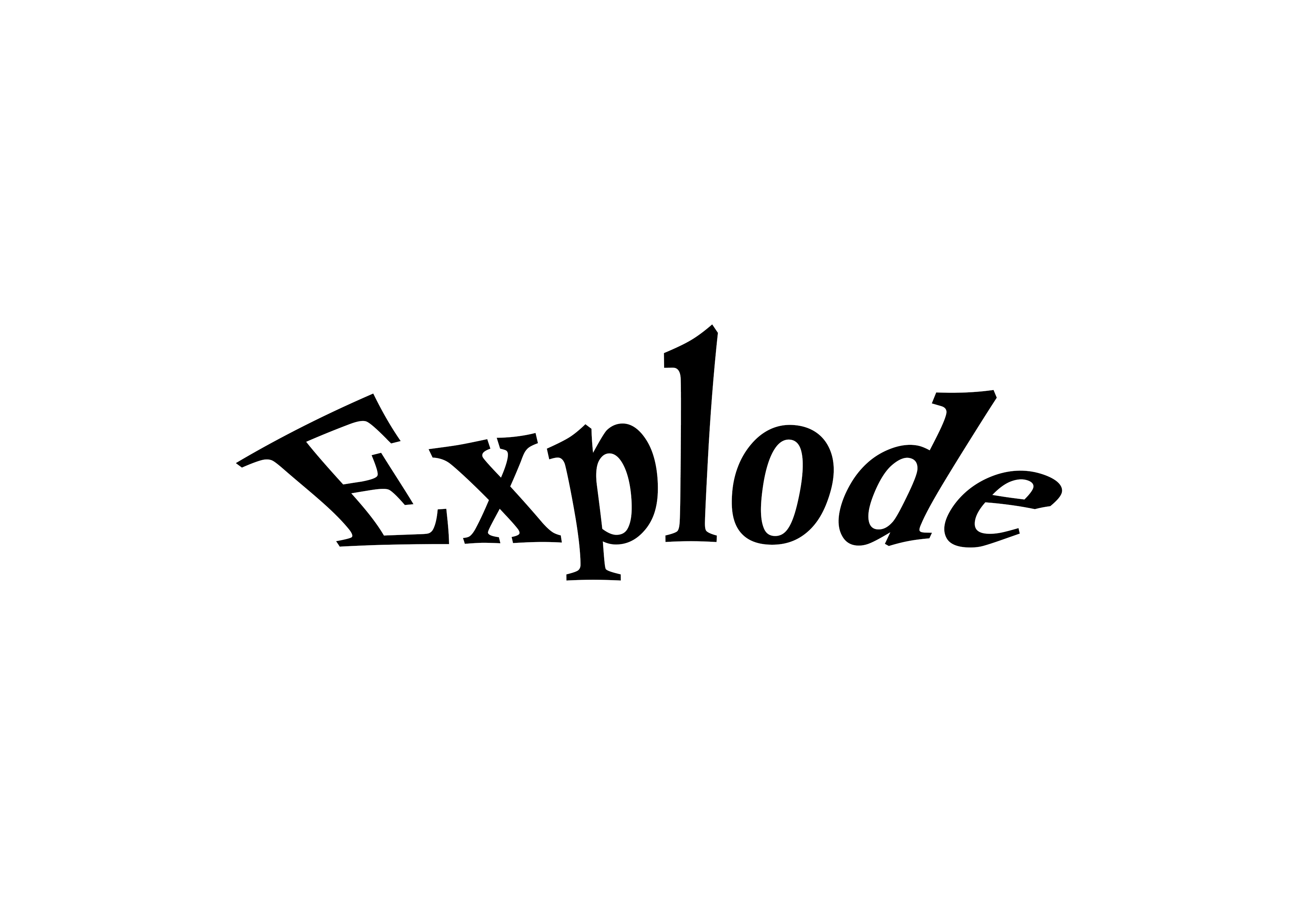
For this week, we have to choose one word from the listed words given from week 1 and animate it into a gif. So the word I chose is 'explode'. The word explode is another definition of expanding when it comes to design, therefore my idea is to expand the other letters as the skull (letter O) to just stay put, so it showed that it's the bomb itself that causes the explosion.

Fig 5.0 Animated gif part 2 (12/4/2022)
I managed to finish it by the 24th frame. During the process, I also changed the timing of the frames to make them faster. So, this is the final animation.
Final Submission -
Final text expression in JPEG format
%20(2).jpg)
Fig 5.1 Jpeg format (13/4/2022)
Fig 5.2 PDF Format (13/4/2022)

Fig 5.3 Animated gif final (13/4/2022)
Task 1 | Exercise 2
Text formatting (part 1) | 17/4/2022
For our second exercise, we were given the task to create a final design that addresses different areas enclosed by text formatting, such as kerning, leading, paragraph spacing, alignment, etc. We were also assigned to use the 10 typefaces given. The designs are to be completed in software called Adobe InDesign.


Fig 5.4 Text formatting exercise 1 Fig 5.5 Text formatting exercise 2
(17/4/2022) (17/4/2022)

Fig 5.6 Before kerning and tracking (17/4/2022)
As you can see there are some letters that are quite close to each other, before kerning and tracking, it shows how less of interest it would look like to the readers if it were to be put in the magazine or books.

Fig 5.7 Before kerning and tracking (17/4/2022)
A definition of kerning is to be able to give spacing or no spacing of the text. Another example shown in Fig 2.4 below is when I experimented with using kerning. It made a lot of difference from Fig 2.3.

Fig 5.8 Before kerning and tracking (17/4/2022)
.jpg)
Fig 5.9 After kerning and tracking (17/4/2022)
Text formatting (part 2) | 18/4/2022
To begin with this part 2 exercise, we need to understand the basics of the grid system. It would be easier to apply the texts in the layout with an organized layout. As Mr. Vinod explained in the previous lecture, A good page layout depends on a good margin space and column. A margin that is arranged properly doesn't always have a good outcome.
Here's how I start, I began with an empty document then I decided to divide the columns into 2 so the wordings would look more organized. A magazine reader's perspective I would say.
To Add columns- open a document > Layout > Select margins and columns
Fig 6.0 Empty document (18/4/2022)

Fig 6.1 Dividing the column into 2 (18/4/2022)

Fig 6.2 two columns layout (18/4/2022)
I then will copy these texts into the 2 columns I created and paste them into the document. However, I will have to copy half of the text since it will be divided into the layout.

Fig 6.3 Text formatting gave (18/4/2022)

Fig 6.4 Texts to copy and paste (18/4/2022)
To copy and paste on windows - Higlight the text > Ctrl C > Go to InDesign Doc > Ctrl V

Fig 6.5 Copy-paste text (18/4/2022)

Fig 6.6 Correction progress to the text (18/4/2022)
I played around with the spacings to get a better look at the paragraph but to prevent it to look so tight and close to each other I used the paragraph spacing to justify the last line to the left. In addition to that I made another few spacings again on the words, as you can see in the figure below, it has multiple dashes in the paragraphs with unconnected words.


Fig 6.8 Text formatting progress (19/4/2022)
As for the texts, font sizing is important as well, looking back at what my lecturer said while commenting on my classmate's work, the font size for A4 and A3 documents is usually between 8 - 12 points in size. I went for 12 points just for the audience to read it better.

Fig 6.9 Font Size and Paragraph Spacing (19/4/2022)

Fig 7.0 Text formatting progress (19/4/2022)
I went back and rearrange the paragraph spacing because I didn't want the paragraph to be close to the columns.

Fig 7.1 Text formatting progress (19/4/2022)
To look at base line grid- Select view > Select "show base line grid

Fig 7.2 with base line grid (19/4/2022)

Fig 7.3 Baseline increment (19/4/2022)

For text frame options- Right click > Text frame options

Fig 7.5 text frame options (19/4/2022)

Made sure the texts align well. Use the character section to play around with the spacing to align the texts. Make sure it stays above the line.

Fig 7.7 aligning texts (19/4/2022)
Import the images as well by Clicking file > place > select your image

Fig 7.8 Place the image on the document (19/4/2022)
Now I will be doing one lat organizing by improving the texts in the document and texts that were out of the line, again using the paragraph spacing and kerning as well.

Fig 7.9 Organizing (20/4/2022)
VIsual Research | 20/4/2022
.jpg)

Fig 8.1 Layout reference from Pinterest (20/4/2022)


Fig 8.3 layout reference from Pinterest (20/4/2022)
I did 5 different types of layouts with different arrangements from the text to the photos, I would say it's simple and quite easy for the readers to read, and hint of light from the photos.
- Fonts used - Gill Sans MT
- Fonts size - 11pt
- Line spacing - 14pt (body text) 13.2 (header)
- Paragraph spacing - 14pt
- Alignment - Left alignment

Fig 8.4 Second layout (21/4/22)

Fig 8.5 Third layout (21/4/2022)

Fig 8.6 Fourth layout (22/4/2022)

Fig 8.7 Fifth layout (22/4/2022)
After receiving feedback from our lecturer, I made a few mistakes on the steps, as well as the picture that has to do with "Helvetica"
Here I have made a few of those changes. I decided to go for this picture to replace it with the non-Helvetica picture shown above.

Fig 8.8 New picture for the layout (1/5/2022)
These are the updated layouts.
.jpg)
Fig 8.9 Updated layout 1 (1/5/2022)
.jpg)
Fig 9.0 Updated layout 2 (1/5/2022)
.jpg)
Fig 9.1 Updated layout 3 (1/5/2022)
Final text formatting in JPEG format
.jpg)
Fig 9.2 Final layout JPEG (2/5/2022)
Fig 9.3 Final layout in PDF (2/5/2022)
- Fonts used - Gill Sans MT
- Fonts size - 11pt
- Line spacing - 14pt (body text) 13.2 (header)
- Paragraph spacing - 14pt
- Alignment - Left alignment
- Columns - 2
Reflection
Experience
Since this was my first time doing type expressions, I managed to keep up and able to learn more about it. Adobe InDesign was a first as well, I was completely lost when I started using it, but with some tutorials and some help from my classmates, I managed to get used to it for the past 4 weeks. This caused a lot of critical thinking for me knowing that we have a lot of things to prepare, It does give me the opportunity to develop the typography skills for the future. I was able to experiment with a lot of things, thus trying my hardest to keep up with a bunch of design options in order to come out with something new.
Observation
The idea of understanding the history of typography blows my mind, I just knew back in my diploma that doing typography is about designing your own magazines with the ability to align words correctly and to have a few pictures surrounding it like a magazine cover. In this class, I manage to understand a lot more than just "designing". I'm quite surprised I made it this far to know more than just "designing".
Findings
Typography is an important part of the designing industry without it, it just comes of as a weird perspective to the audience. I must say it was tricky at first but it did come off as an amazing outcome once it has been published. However, now some of us are still learning as still developing the skill to become better. It is for the best use for the future.
Feedback
Week 2 - Explore more on the sketches. Give out more ideas by asking yourself questions.
Sketch out whatever comes to your mind.
Week 3 - Try and look towards the idea of the images while understanding how to animate, look back at the tutorials and take notes on how to make the animation smooth.
Complete the blog as well, continue on with the further reading and summarize your readings.
Week 4 - Use the rest of the time I have to complete the blog, as well as the readings.
Further Reading(s)
1. Typography Essentials: 100 Designs Principles for working with type By Ina Saltz

Fig 9.0 Book by Ina Saltz (6/4/2022)
This book helped me a lot with designing, but not only with typography, it did help me with graphic designing. It also has a deeper understanding of typography. I made a lot of notes to help me with the exercises given in order to get some idea of what I wanted to do for the exercises.
In addition to this read, It teaches you the aspect of typography which which based on exercise 2 given, the lettering, and from there it can be modified if it were to be handsaw. I must say it is quite interesting to learn its theory of it.
2. Letterforms: Typeface design from past to future by Timothy Sara

Fig 9.1 Book by Timothy Sara (15/4/2022)
I admire how this book focuses a lot of the history of typography, which lead me to understand a bit more about why typography was created. What I find interesting is that we are able to search or explore different countries or fonts that were to exist in different centuries and can be used to create and be improvised today. Although I find some fonts may look the same, the fact that it has a story behind each font, like every book written from the past of someone's life. As you can see that way before technology was invented, a lot of people have been using pens and paper to create different Ideas of fonts. Let's say Latin was one of them, and each would be used to discover new fonts till today.
3. Type Rules! The Designer's Guide to professional typography by Ilene Strizver

Fig 9.2 books by Ilene Strizver
Well, the title gave it away while I was reading this book, It clearly states the dos and the dont's as to what we're supposed to do for typography, as it did help me out while I was doing the exercises. It was a very interesting rule to follow although I got stuck in the middle of trying to follow up with it, then I understand that it isn't about following but understanding the basic rules of typography. However, as mentioned in the book I managed to pick up a few details such as the sizes of the fonts and how to rely on the balance while figuring out what's best for your design.
Comments
Post a Comment