Advanced Typography | Final Compilation
1/12/2023 (Week 14)
Nurul Asilah Binti Mohamad Asif//0353346
Bachelors of Design (HONS) in Creative Media
Advanced Typography // Final Compilation // Reflection
Task 1A | Typographic Systems
 |
| Fig 1.0 Axial Typographic System |
 |
| Fig 1.1 Radial Typographic System |
 |
| Fig 1.2 Dilational Typographic System |
 |
| Fig 1.3 Grid Typographic System |
 |
| Fig 1.4 Modular Typographic System |
 |
| Fig 1.5 Transitional Typographic System |
 |
| Fig 1.6 Random Typographic System |
 |
| Fig 1.7 Bilateral Typographic System |
Fig 1.8 Typographic System Final with Grid PDF format
Fig 1.9 Typographic System Final PDF format
Task 1B | Type and Play
Fig 2.1 Type and Play Poster in PDF format
Task 2 | Key Artwork Collateral
 |
| Fig 2.2 Asilah Key Art Work Black and White |
.png) |
| Fig 2.3 Asilah Key Art Work White and Orange |
.png) |
| Fig 2.4 Asilah Key Art Work Green |
 |
| Fig 2.5 Asilah Key Art Work Orange and Yellow |
 |
| Fig 2.6 Bag Mockup #1 |
 |
| Fig 2.7 Bag Mockup #2 |
 |
| Fig 2.8 Bag Mockup #3 |
 |
| Fig 2.9 Mug Mockup |
 |
| Fig 3.0 Sweatshirt Mockup #1 |
 |
| Fig 3.1 Sweatshirt Mockup #2 |
 |
| Fig 3.2 Sweatshirt Mockup #3 |
 |
| Fig 3.3 Asilah GIF |
Fig 3.4 Asilah Key Art Work in PDF Format
Fig 3.5 Sweatshirt Mockup in PDF Format
Fig 3.6 Mug Mockup in PDF Format
Fig 3.7 Bag Mockup in PDF Format
 |
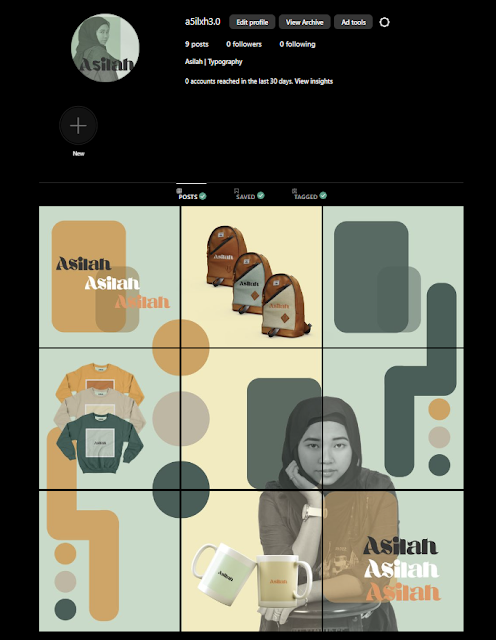
| Fig 3.8 Instagram Homepage |
Task 3 | Type Exploration and Application
Fig 3.9 Egypto Cryo Full Regular Font
Link to font file: https://drive.google.com/drive/folders/1De3ML8jFzkvVfoFFW8dzae6dsSKzV0wd?usp=sharing
Application
Fig 4.0 Egypto Cyro Font Application
Fig 4.1 Type Exploration and Application in PDF Format
Reflection
Experience
Diving into the world of typefaces and typography has been a delightful voyage through the artistry and functionality of letters. Exploring different font families, styles, and typographical elements feels like wandering through a vast library where each typeface tells a distinct story. Understanding the nuances between serif, sans-serif, script, and decorative fonts unravels their unique personalities and intended uses. Experimenting with typography has not only refined my eye for design but also taught me the importance of choosing the right typeface to evoke specific emotions or communicate a particular message effectively. It's a realm where creativity intertwines with functionality, and each typographic choice carries the potential to shape perception and enhance communication in subtle yet impactful ways.
Observation
Observation within type exploration and its application in typography has been akin to deciphering a secret language embedded in our everyday visual experiences. It's the subtle yet powerful influence of fonts on our perceptions and interpretations. Therefore, it brings a whole "adventure" throughout this whole process. Through keen observation, one can discern the nuances between typefaces—how a serif might lend an air of tradition and reliability, while a sleek sans-serif exudes modernity and simplicity. This observation fuels a designer's ability to strategically apply typography, understanding how certain fonts resonate with specific audiences or contexts. It's a study in balance, rhythm, and harmony, where the interplay of fonts, sizes, and spacing orchestrates a symphony that guides the viewer's understanding and emotional response to the conveyed message.
Findings
Through extensive type exploration and its practical application in typography, intriguing findings have emerged, unveiling the profound impact of font choices on communication. One prominent discovery lies in the nuanced psychology behind typefaces and their ability to evoke emotions, convey tones, and influence perceptions. Serif fonts often evoke a sense of tradition, reliability, and formality, while sans-serif exude modernity, simplicity, and approachability. Moreover, findings underscore the significance of typographic hierarchy and the strategic use of font sizes, styles, and spacing as well as to guide reader attention and emphasize key messages. This exploration has emphasized the pivotal role typography plays in shaping not just visual appeal but also the efficacy of conveying information, reinforcing the importance of thoughtful font selection and arrangement in effective communication design.
.png)


Comments
Post a Comment